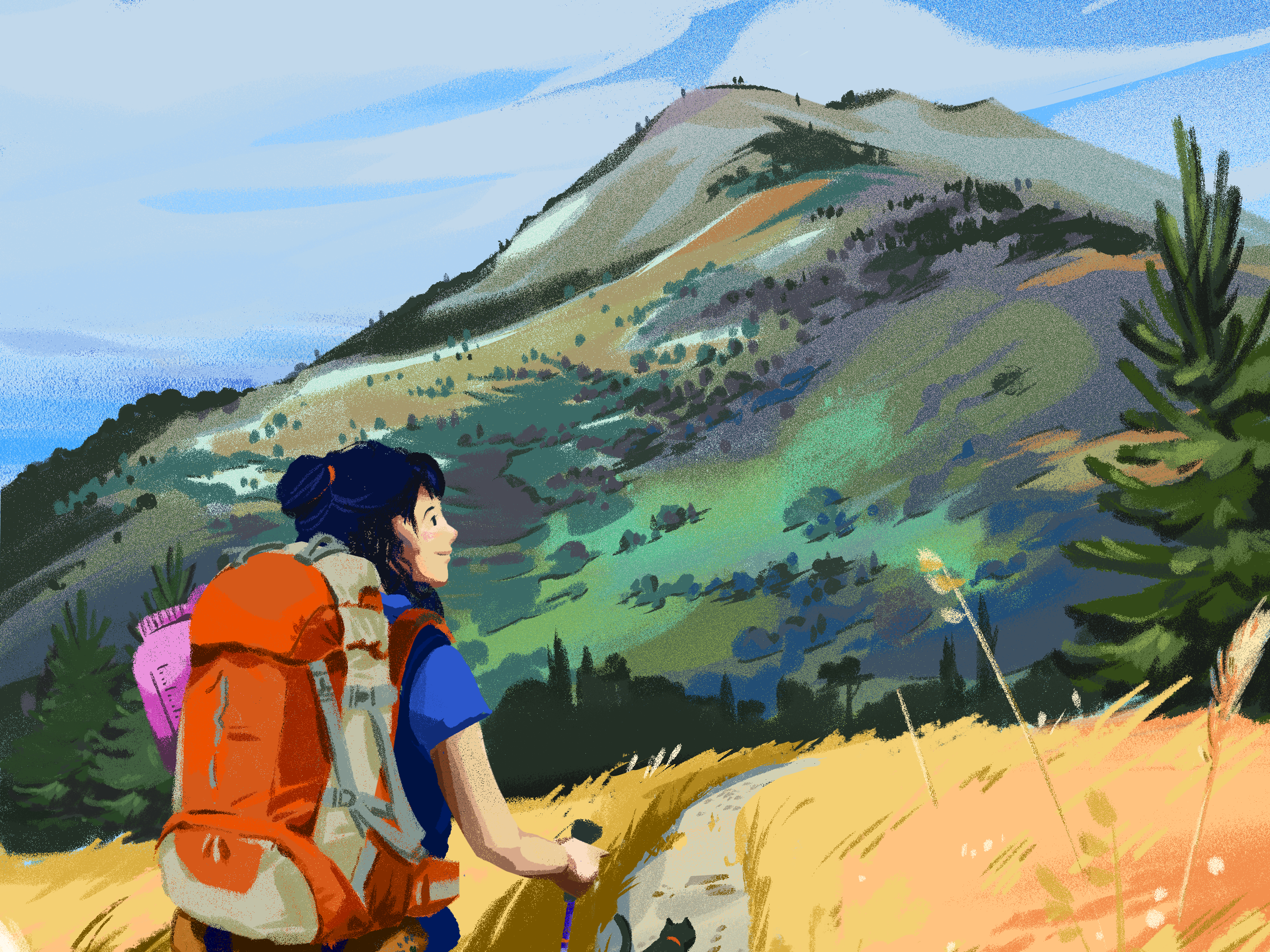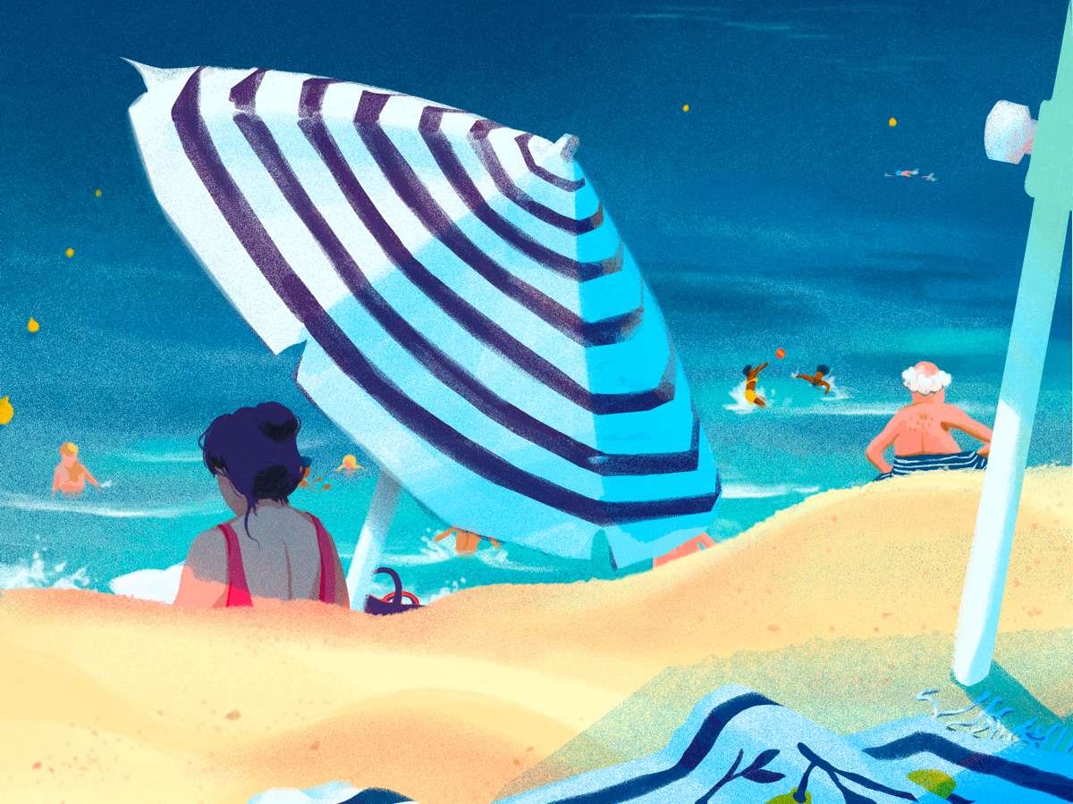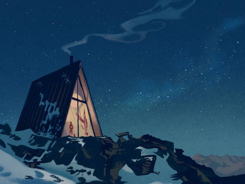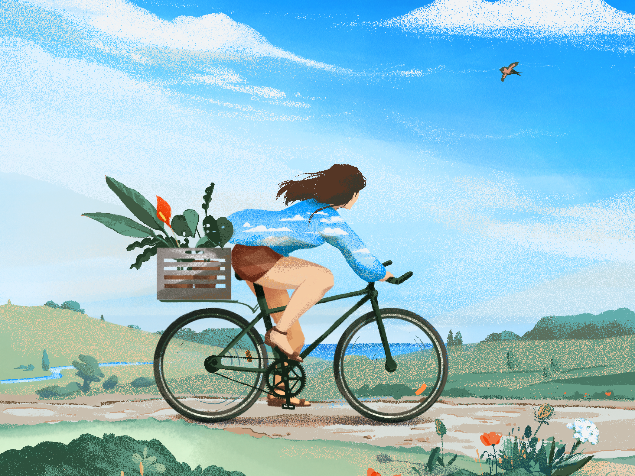

The greatest challenge with designing a multi-channel national campaign is maintaining unified aestheticism while ensuring the flexibility of the concept in mass-scale resizing (we had over 70 print and digital formats for very small team). We often encountered limitations with studio photography, where background elements would reduce legibility, but we could not have a tailored photoshoot setup for each format. Illustrated, vectorized elements with a flat, flexible textured background solved this issue, lending a whimsy associated with handicraft and eye-catching colours.

Art directing the animation team was a fun process of exploring ridiculous ideas inspired from vintage games such as Mrs. Pacman and Whack-a-mole. I created a layout system for the main formats in square, landscape, and portrait, which the junior designers then followed and applied to the many variations. Apart from establishing this previously non-existent system that cut down redundant back-and-forth of layout reviews, my role of centralized art direction facilitated better cooperation between marketing and design.